Gathering cyber incident reports and analyzing them is an architectural challenge. As an initiative to make cyber threat intelligence more accessible, CyberPeace Institute launched Project Genesis in partnership with Kineviz to visualize the shifting patterns and trends of cybersecurity. By connecting the dots — quite literally — with graph databases and interactive data visualization, Project Genesis interprets the state of cybersecurity with clear and compelling views that capture the scope of cyber threats across the globe. This project is an initiative to build a cyber threat accountability framework that stresses the importance of making security our collective responsibility.
From inside the CyberPeace Institute
Peace in cyberspace starts with knowing the full impact of cyber attacks and holding the bad actors accountable. In a rapidly changing cybersecurity climate, the analytic infrastructure of cyber threat intelligence must evolve to speak to a wider audience. In this case study, we visualize cyber threats with public security incident data through interactive and intuitive data visualization.
We began our research using the VERIS Community Database (VCDB); an open and free repository of publicly-reported security incidents logged in the Vocabulary for Event Recording and Incident Sharing (VERIS) format. As a common language for describing security incidents in a structured and repeatable manner, the VERIS taxonomy enabled us to aggregate incident data through provoking, multifaceted views on cybersecurity.
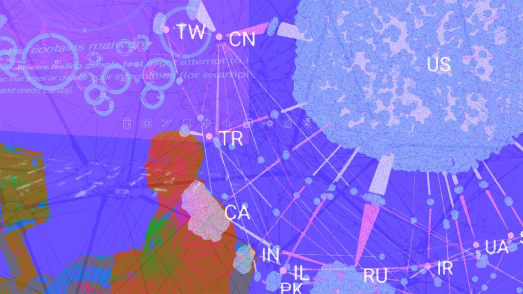
VIEW 1: Cyber incidents (in blue) by country (in orange) delineating the line of attack from the actor (in red) to the target (in purple). Countries are labeled using ISO alpha-2 codes.
Data Limitations
The VCDB is “an unrestricted, comprehensive raw dataset ready for download on security incidents that is sufficiently rich to support both community research and corporate decision-making.” Despite this, it is important to keep in mind certain biases that impact our results. First off, the VCDB focuses on the US cyber landscape since its data was primarily provided by US-centric cybersecurity firms. It is also biased towards the Health sector given that HIPAA requirements mandate the public disclosure of breach incidents. Recent data is likely more incomplete than prior years as there is an observed latency period – about 2 years – between when an incident propagates through a network and when it is well-documented and assimilated.
Delving into incident reports
In the VCDB, more than 9000 entries are unevenly distributed across 1500 event descriptions describing 6500 security incidents. It happens to be a very wide dataset which is a result of the varied attribution methodologies used by cybersecurity firms. This left us with more empty fields than populated ones. Hence, we decided to concentrate our analysis on the Action taxonomy under the VERIS A4 threat model consisting of Actors, Actions, Assets, and Attributes. We started off with the 14 most consistently filled event descriptions below:
‘Country’
‘Employee Count’
‘Industry’
‘Region’
‘State’
‘Victim ID’
‘Incident Year’
‘From Country’
‘Action’
‘Locations Affected’
‘Secondary’
‘Revenue’
‘Notes’
‘Sector’
By concentrating on the most populated threat actions, we could begin tracking the dynamic changes across time-dependent features. We started simply by quantifying threat actions using a time-series histogram as illustrated by Grove – a BI extension of GraphXR.
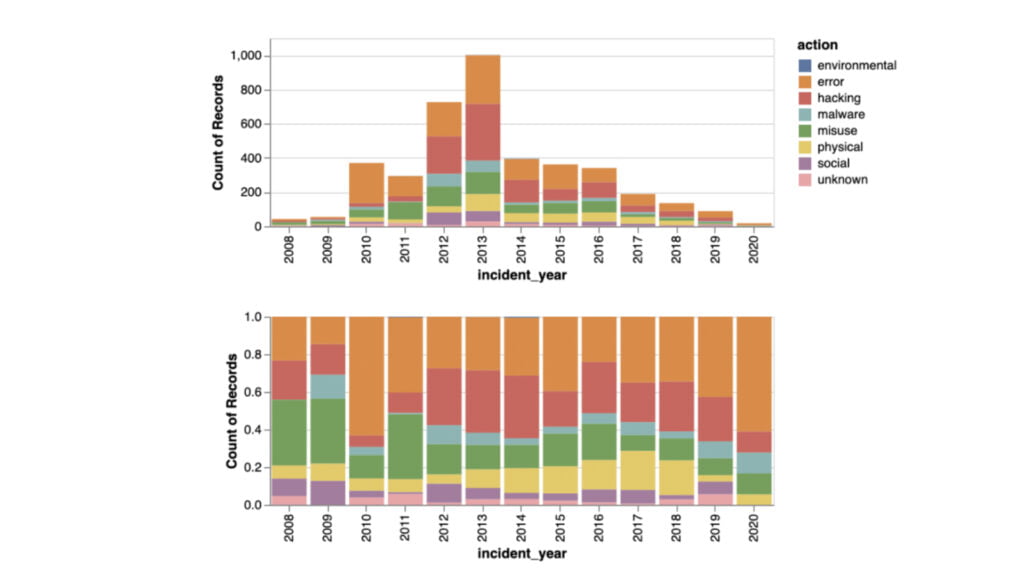
VIEW 2: Threat actions are aggregated by color to show the ratio (on bottom) and absolute value (on top).
The seven primary categories of threat actions in VERIS (Malware, Hacking, Social, Misuse, Physical, Error, and Environmental) described in detail here are framed in View 2 as an absolute value (above) and as a ratio (below) for each year. As an absolute value, we found an unmistakable increase of threats between 2008 and 2013, followed by a sharp decrease in 2014. With the rate of threat actions, we could mark subtle changes such as the gradual decline of misuse and the consistency of errors and hackings over the years.
However, to answer who is on the other side of these threats, we assess their impact on the top nine industries. In View 3, we quickly capture the industries primarily affected – the public administration and the healthcare & social assistance sectors – who suffer majorly from threat actions in error (in orange) and misuse (in purple). With that in mind, we hone in on the most targeted and draw parallels to ongoing research such as this report published by the CyberPeace Institute on attacks specifically on the healthcare sector.
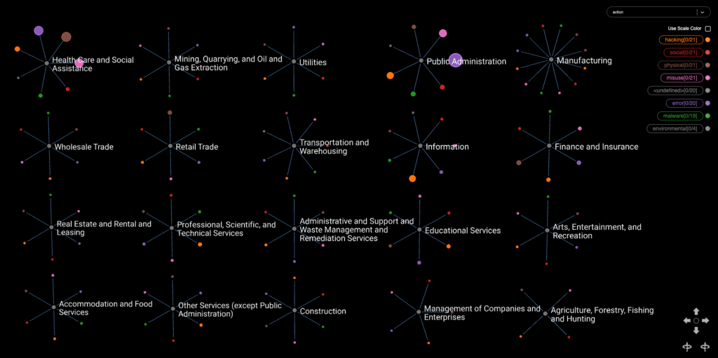
VIEW 3: The impact of different threat actions on the top nine most represented industries. Node size is dependent on how many incidents have been reported with the respective threat action.
Geographical distribution of cyber threats
Knowing where incidents arise and whom they attack is half the battle. With data visualization, we can see the concentration of attacks, as well as, the relationship between geopolitical entities. In View 4, we observe a geopolitical understanding of cyber incidents while confirming some well-known rivalries between India and Pakistan, North Korea and South Korea, and China and Taiwan. The concentration of incidents are indicated by ring size, marking the direction of attack from the incident (in green) to the targeted country (in blue). While the US appears to be the center of attack in this view, the dramatic difference in the number of reported incidents is likely a result from the US-centric incident data brought into VCDB to start.
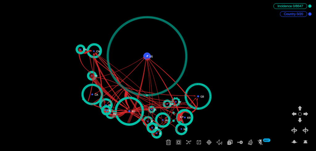
VIEW 4: Concentration of incidents (in green) around countries (in blue) with edges (in red) converging on the target country.
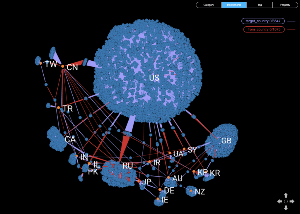
We can also take the distribution of cyber incidents into a GIS visualisation scheme. Views 5 and 6 emphasize who the victims and actors are by converging edges that give directionality and weight to these threats. With incidents stacked as blue nodes on top of each other, we bring a third dimension to our analysis that highlights their unequal distribution.
The green edges converge on the targeted country and the red edges on the actor country. Across both views, there is a high concentration of threats made between Europe and North America, with less involvement from countries like South America and Africa. The US also appears to be the most targeted country while Russia is the largest threat actor. Confirming our suspicions of geopolitical entities, this high-level view stresses the concentration of threats on any one country, as well as, how they are interconnected.
Without this relational context, it would be hard to convey just how much weight these threats have and who is accountable. Having these high-level views is ultimately a step towards building a stronger accountability framework.
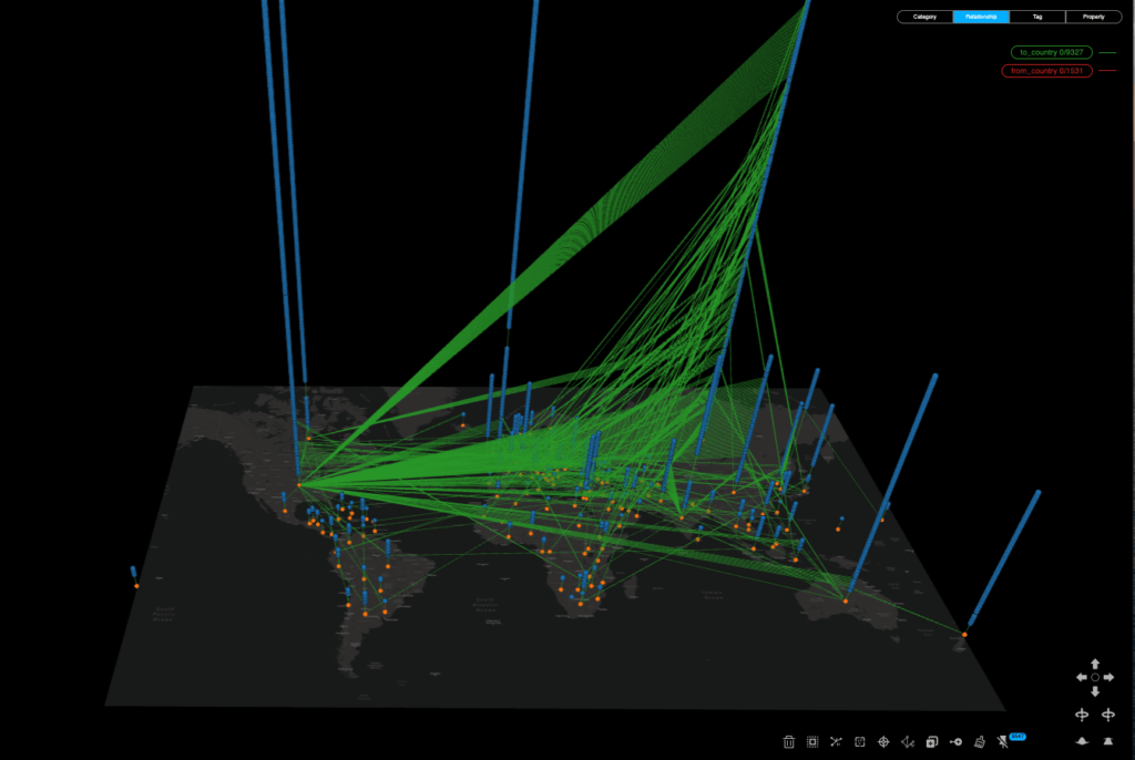
VIEW 5: Cyber threats mapped from the incident node (in blue) to the targeted country node (in orange).
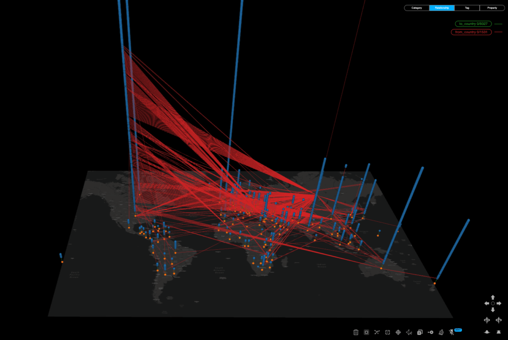
VIEW 6: Cyber threats mapped from the incident node (in blue) to the actor country node (in orange).
Conclusion
This project is an initial step to making the direct impact of cyber threats more visual, interactive, and accessible. It is also an attempt to address the gaps in cyber threat intelligence, using publicly available security incident data and low-code data visualization to tell the story.
The state of cybersecurity is evolving quickly and it requires full transparency for threat actors to be held accountable and for vulnerable populations to be protected. By filling the knowledge gap as quickly as possible, we can have a collective response in addressing cyber threats with data-driven threat intelligence that is clear and poignant. It continues to be a collaborative effort as we continue with Project Genesis to investigate and disseminate cyber threat understanding across the globe.
AUTHORS
Loqman Salamatian is a Ph.D. graduate student at Columbia University in Applied Mathematics and Computer Science.
Alex Law is a Communications Coordinator at Kineviz, providing learning resources and merging art and technology with a community of GraphXR enthusiasts.
Weidong Yang is the founder and CEO of Kineviz. He holds a Ph.D. in Physics and a Master in Computer and Information Science.
DISCLAIMER: This article is part of the CyberPeace Institute’s Guest Blog Series that gives a platform to new voices and fresh perspectives impacting peace in cyberspace. The Institute does not take institutional positions on the issues described in this article. The views represented herein are those of the author(s) and do not necessarily reflect the views of the institute, its staff, or its trustees.